
ScreenFit: Responsive Images with Art Direction

Have you ever encountered the issue where an image looks stunning on a large screen but doesn't fit well on smaller screens? This could be due to text on the image becoming unreadable or the image having too many elements that aren't visible on smaller displays.
Worry not! Our plugin is designed specifically to solve this problem.
With our ScreenFit plugin you increase the visual impact of your online shop. This powerful tool is essential for e-commerce editors and shop owners who want to effectively communicate their brand message and optimise the user experience. It is specially developed for Shopware 6.
See an example of what you can achieve with ScreenFit. Go to Result
HowTo use the ScreenFit Plugin
You’ve downloaded our plugin from the Shopware store – that's fantastic! Now, it's time to learn how to make the most of it. Follow this tutorial to get started with the "ScreenFit: Responsive Images with Art Direction" plugin. First, as always, ensure the plugin is installed and activated.
For the impatient: Go to summary
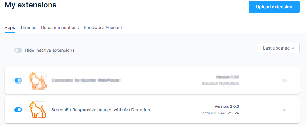
New functionality in the Shopware Backend
After the plugin is intalled, you have following new functionality available for the images on all you content pages.
ScreenFit functionality in detail
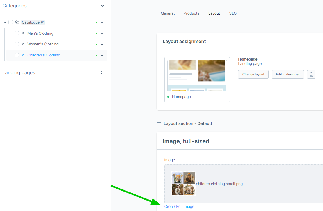
After clicking the link "Crop / Edit image", you will be presented with the following screen:
On the right side, you can see the following elements from top to bottom:
- Alt attribute
- Title attribute
- Screen sizes
- Save and Cancel buttons
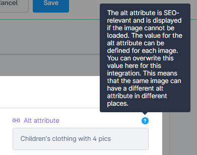
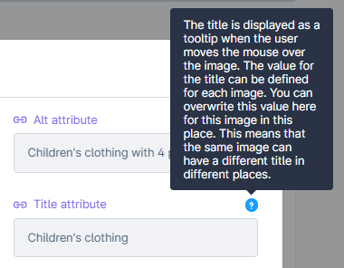
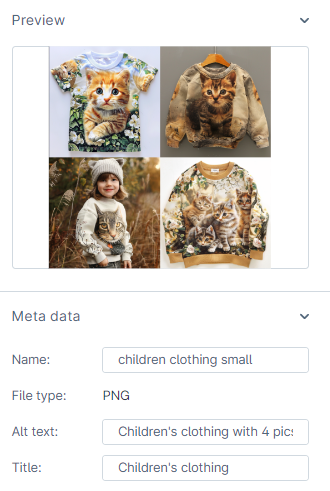
Alt attribute: The alt attribute is SEO-relevant and is displayed if the image cannot be loaded. The value for the alt attribute can be defined for each image. You can overwrite this value here for this usage of your image, allowing the same image to have different alt attributes in different places.
Title attribute: The title is displayed as a tooltip when the user hovers over the image. The value for the title can be defined for each image. You can overwrite this value here for this specific usage. This means that the same image can have different titles in different places.
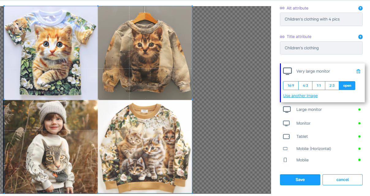
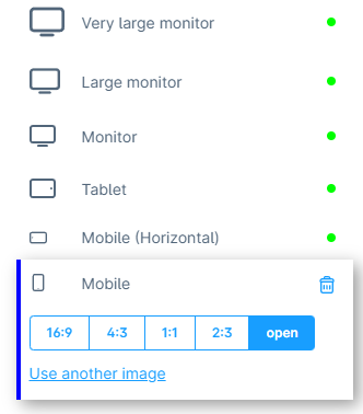
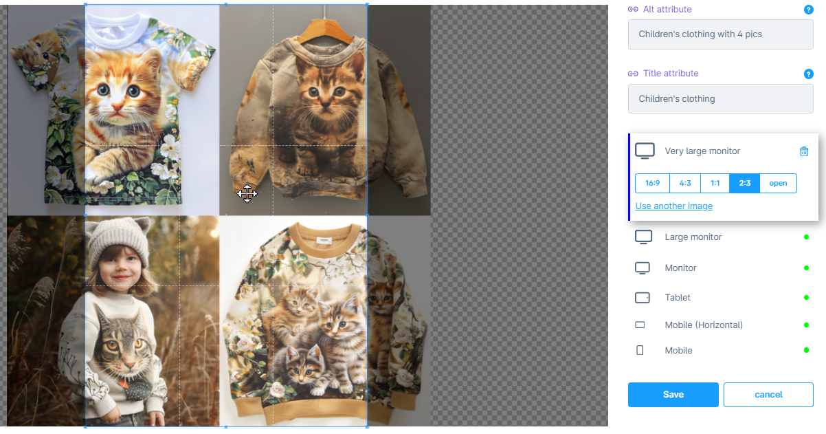
Screen sizes: In the screenshot below, you can see the screen size selector. It consists of a list of different screen sizes. For each screen size, you can select a different image crop. The possible values are 16:9, 4:3, 1:1, 2:3, or "open" (which allows for manual selection of the image crop).
Green dots indicate that an image crop has been selected for that screen size. You can delete this image crop selection by clicking the basket icon. Additionally, you can select a completely different image by clicking the "use another image" link.
Perfect images everywhere
This feature allows you to precisely specify which image crop should be displayed on different screen sizes. Instead of displaying the entire image that looks great on a large monitor, you can define a smaller, more focused image crop that looks perfect on a mobile phone.
On the left side, you will see a rectangle corresponding to your selection. For example, if you have selected 2:3, you will see a 2:3 rectangle, which you can resize and move while maintaining the aspect ratio.
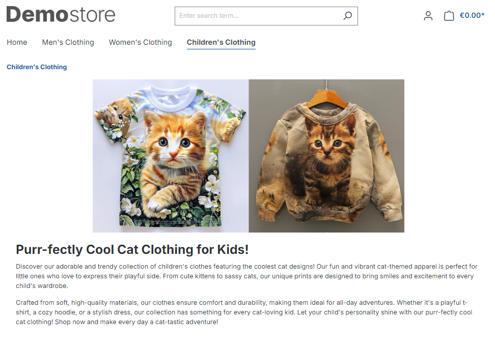
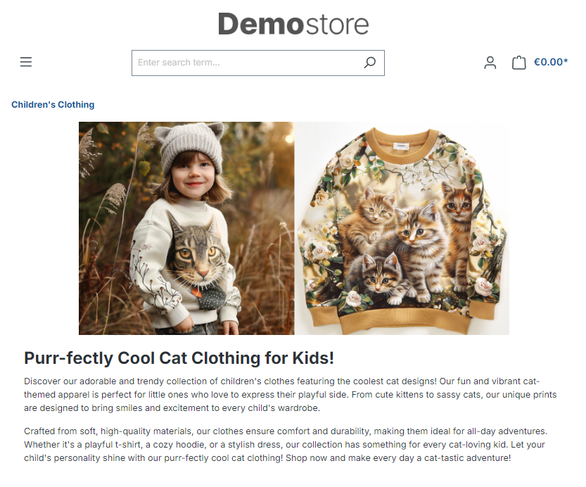
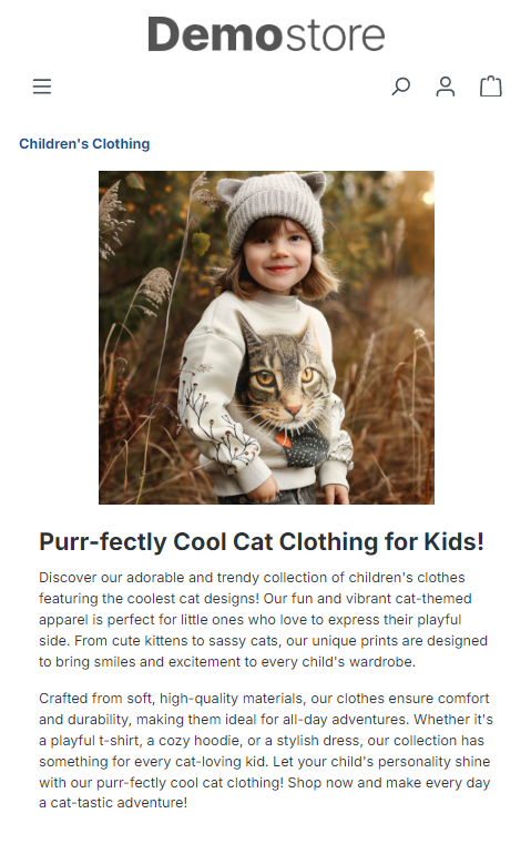
Result of our configuration
For our example, I tailored the image settings to fit various screen sizes. I began with a large image for the biggest screen size. For tablets and horizontal views on mobile phones, I selected a cropped version of the image. For the smallest screen size, which is mobile, I defined an even more focused image crop. Now my content page looks great on all screen sizes. See the following screenshots.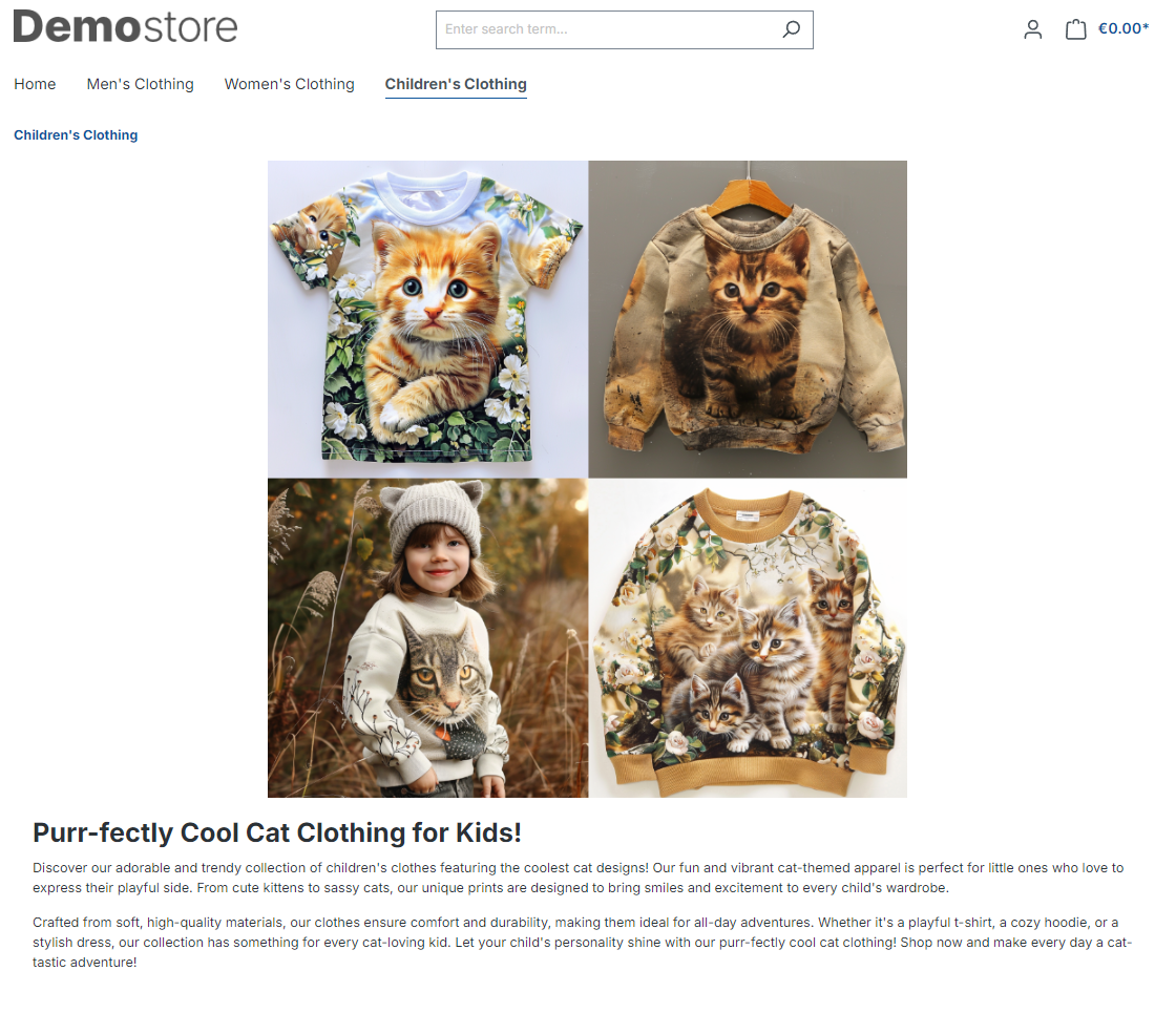
How to use - condensed - short summary
Once you have installed the plugin, you can start using it immediately.
- Open a content page with the image you would like to edit.
- Chose different image crops for different screen sizes.
- Optionally: Remove inheritance and create specific alt text and image title.
- Optionally: Specify different images for differnt screen sizes.
- Save. Admire your work.
Reach out, if you have questions
If you have any questions or need help. Don't hesitate to contact us. We will be happy to help.
